Waves: your personalized surf forecaster
2020 / UI+UX Design / Mobile App
All surfers know that no wave is alike. The conditions at sea are different from day to day and hour to hour.
Because it’s so variable, surfers will often rely on surf forecasting apps to decide when to head for the beach. These forecasters take a bunch meteorological data, analyze it, and then tell you what the conditions will be for the next week or two. They coalesce a lot of useful information, but can be hard to decipher especially for beginners.
I wanted to design a surf forecasting app that would encourage people to surf more by making that decision easier.
Analysis
So before I started designing, I wrote down all the factors that I would usually consider when deciding whether or not to go surfing.
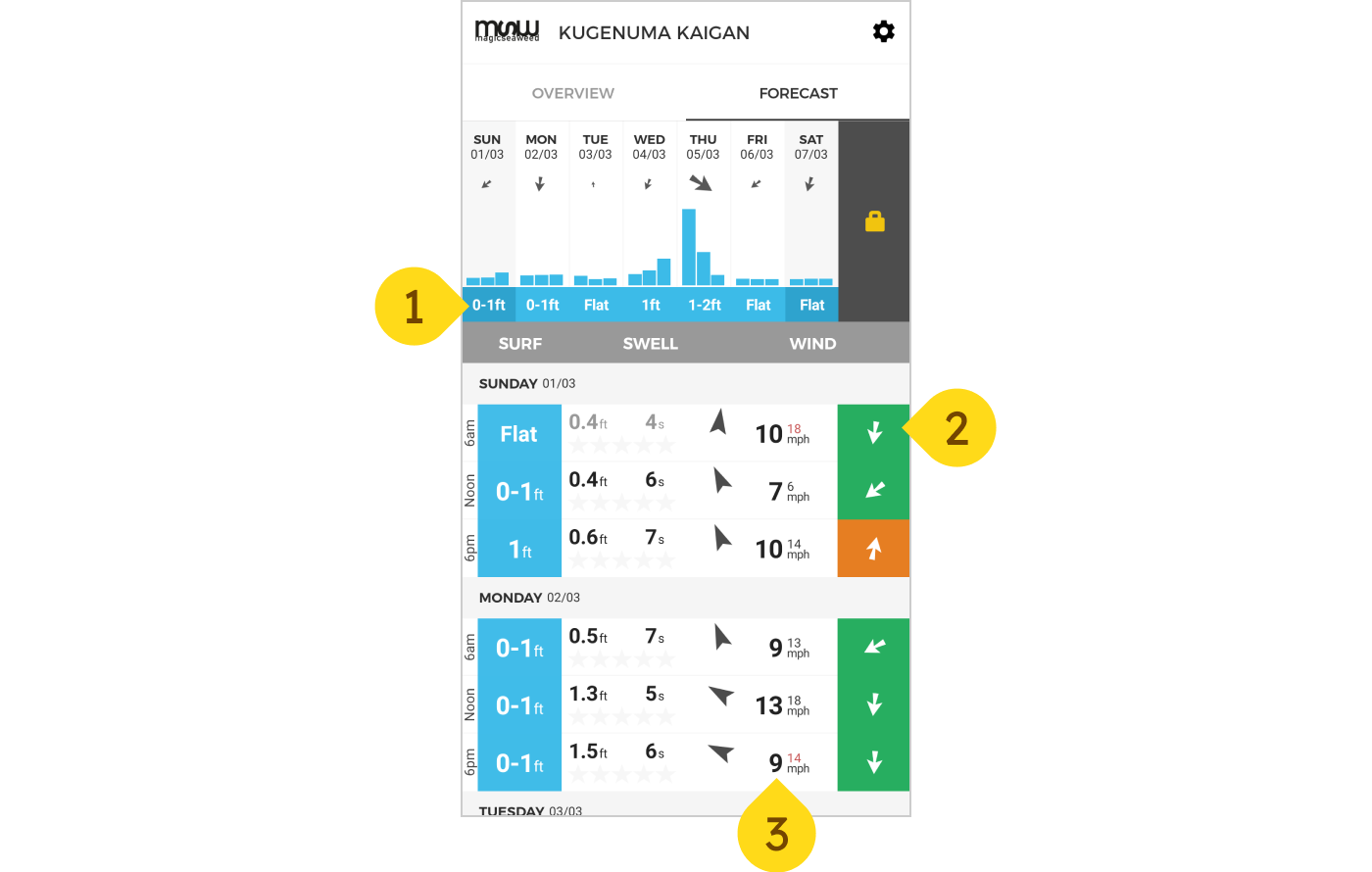
- Wave height - This is the height of the wave from top to the bottom. Too small and there are no waves to surf, too large and it can be too dangerous to surf.
- Wind direction - Wind direction can affect the shape of the wave. When the wind is blowing towards the ocean, also known as offshore wind, it helps the wave keep its shape allowing for a longer ride. The opposite, known as onshore wind, tends to flatten waves making it more difficult to ride.
- Wind speed - When winds are really strong it can make surfing difficult and dangerous. In my area some of the best surf occurs during typhoon season, so it’s important to take it into account.
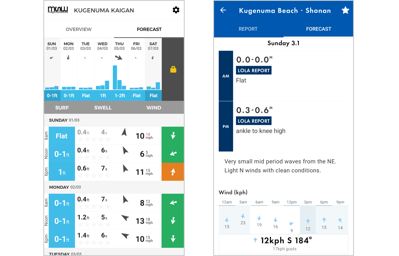
I’m able to get all three of these factors from Magical Seaweed’s app, but there’s a lot of extra information there that I’m not really able to interpret. While it might be useful to a more experienced surfer, the app doesn’t teach me how to understand these values, so unfortunately it just ends up as visual noise.
On a typical week this is my personal routine for deciding when to go surf.
Step 1. Narrow down the chart to just the days I can go surfing. For me that’s the weekends (Saturday & Sunday).

Step 2. See which one has larger waves, only because the waves haven’t been very big this winter. This week it is Sunday clocking in at 0-1ft.

UX Design
Based on my analysis, there were a few things I wanted to change for my own app.
- Instead of showing the forecast for the entire week I wanted to focus only on times when users are available to surf.
- Instead of giving people numerical data that they had to interpret by themselves, I wanted to give the user an explanation of the conditions like how a friendly surf instructor would.
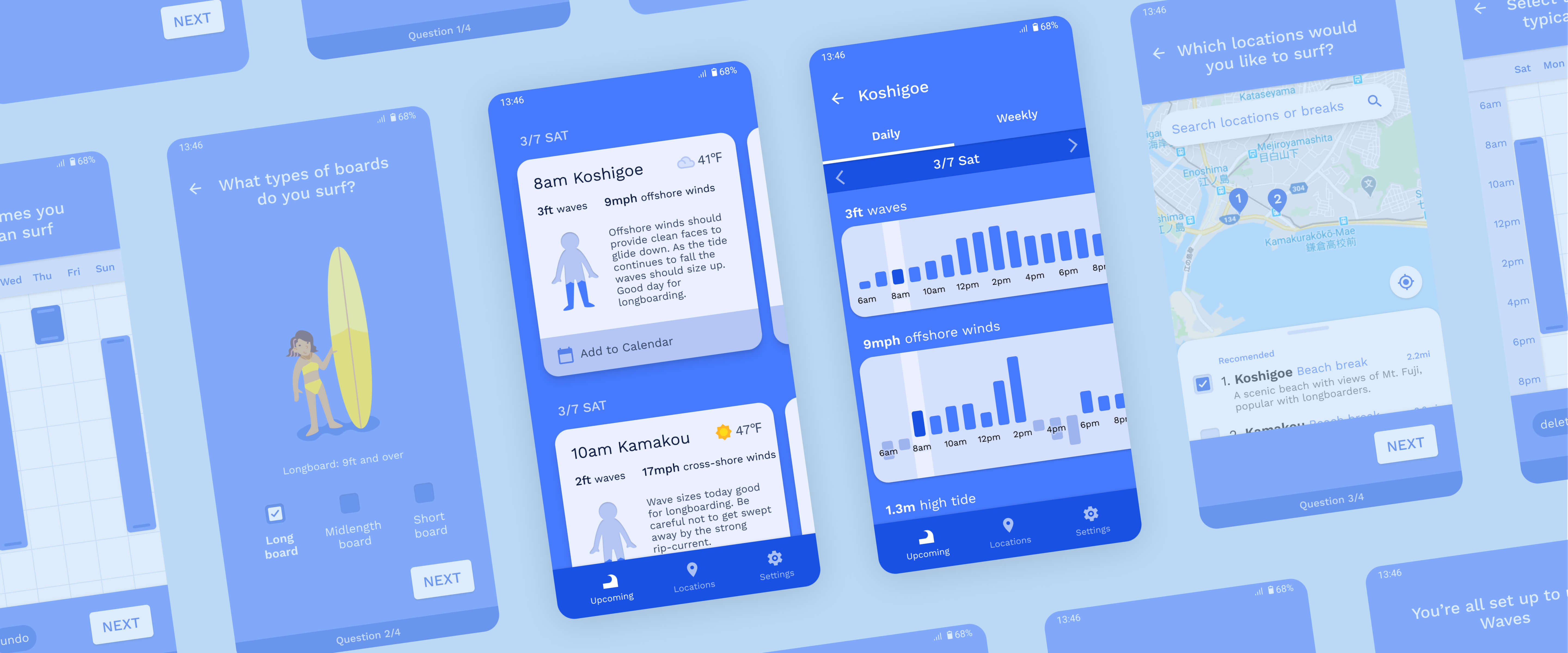
My app would recommend users times to surf based on their availability. With this concept I mocked up a few wireframes, arriving at the following design.
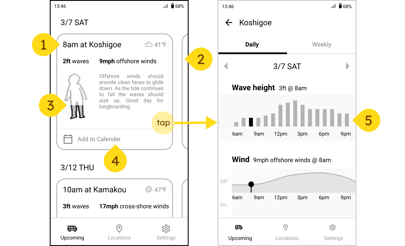
- Recommendations for times to surf are organized into cards. Each card details when, where, wave height, wind conditions, and a brief comment on the conditions that day.
- Cards are organized by day. By swiping horizontally users can see alternative times & locations for the same day.
- Wave height is represented using a human. In addition to displaying wave height with numbers, I wanted to bring emphasis to it by including a visual representation. Surfers will often refer to wave height using parts of their body (ex. Knee high waves, up to the chest, overhead, etc).
- Add to calendar allows people to quickly save the event to their calendar app.
- Tapping on a card would bring you to a more detailed view showing the daily/weekly hour-by-hour breakdown of the wave conditions.
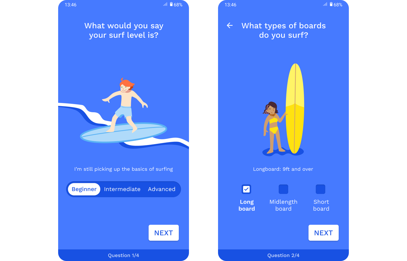
Because the recommendations are tailored to the user’s availability, I knew that I needed a simple onboarding process. Additionally I saw an opportunity to further personalize the recommendations by asking them questions about what level they thought they were and what surfboards they owned.
While I briefly considered a typical form type interface for the onboarding, I ultimately decided that by splitting these questions into multiple pages, it would keep things more simple.
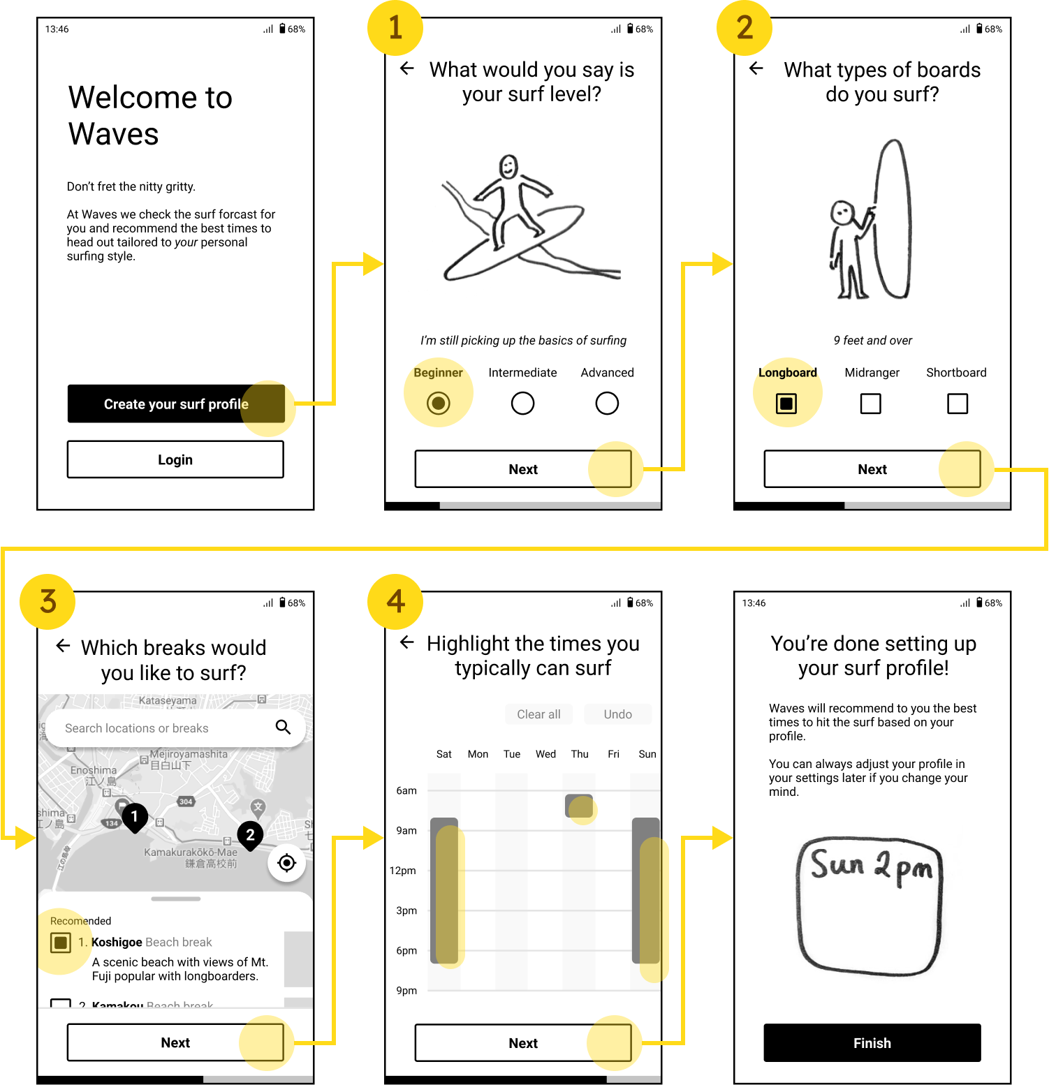
This onboarding process would ask about:
- Surf Level - So that the app could recommend waves conditions that were appropriate for that level of surfer (ex. Not recommending 5ft waves for a beginner surfer).
- Surfboards - So that it could recommend certain boards for certain conditions (ex. a shortboard for when waves are larger).
- Locations - So the users could pick a few surf spots near them for more options.
- Availability - So that we’re only recommending times that people are available to surf.
Later on in the process I added a few screens I forgot about like account details (email, passwords, etc.) and an email confirmation page, but for now I think that this wireframe would be enough to start asking users what they thought were relevant, unnecessary, or missing.
UI Design
So now that I had my basic design hashed out, I was ready to start with the user interface design.
Some decisions I made for the UI Design was to,
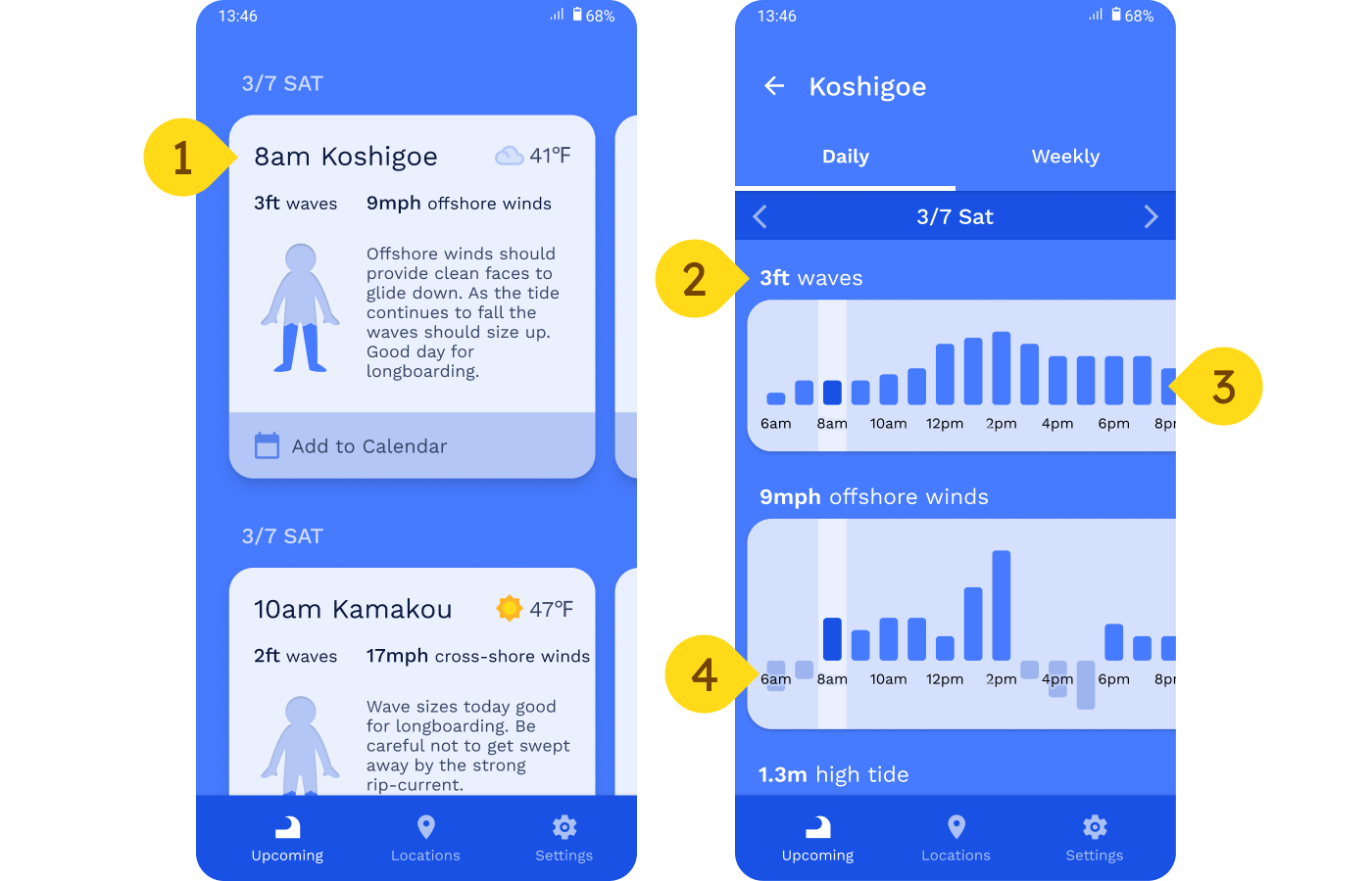
- Keep to a single color pallet. I found that the Magical Seaweed app had used color to indicate states, but I was never quite sure what it meant (ex. Does green=good & red=bad, or does green=weak & red=strong?), this would also mitigate some of the accessibility issues when it comes to using colors like green and orange together.
- Use the graph titles as data labels. It’s difficult to fit a bunch of information onto a tiny screen, and one way that mobile sacrifices usability is that it’s hard to label each individual bar. I decided to compromise so that when a certain bar is highlighted (by tapping on it), the corresponding graph title changes to reflect the value.
- Allow the graph to overflow. While in an ideal world, the entire graph would fit on a single screen, because we have to account for smaller screens too it makes more sense to give each bar breathing room and let the data overflow. Even with the overflow, core surfing times are all visible without scrolling so it shouldn’t impact usability as much.
- Emphasize offshore winds. Like I mentioned earlier, offshore winds are preferred over onshore winds, so by deemphasizing onshore winds we teach the user to only focus on onshore winds.
On the onboarding screens I decided to add a few fun illustrations for both visual interest and added helpful information.
Credit
- Icons from Material.io
