ecoATM: Hybrid Pricing
2023
UI+UX Design
User Research
Background
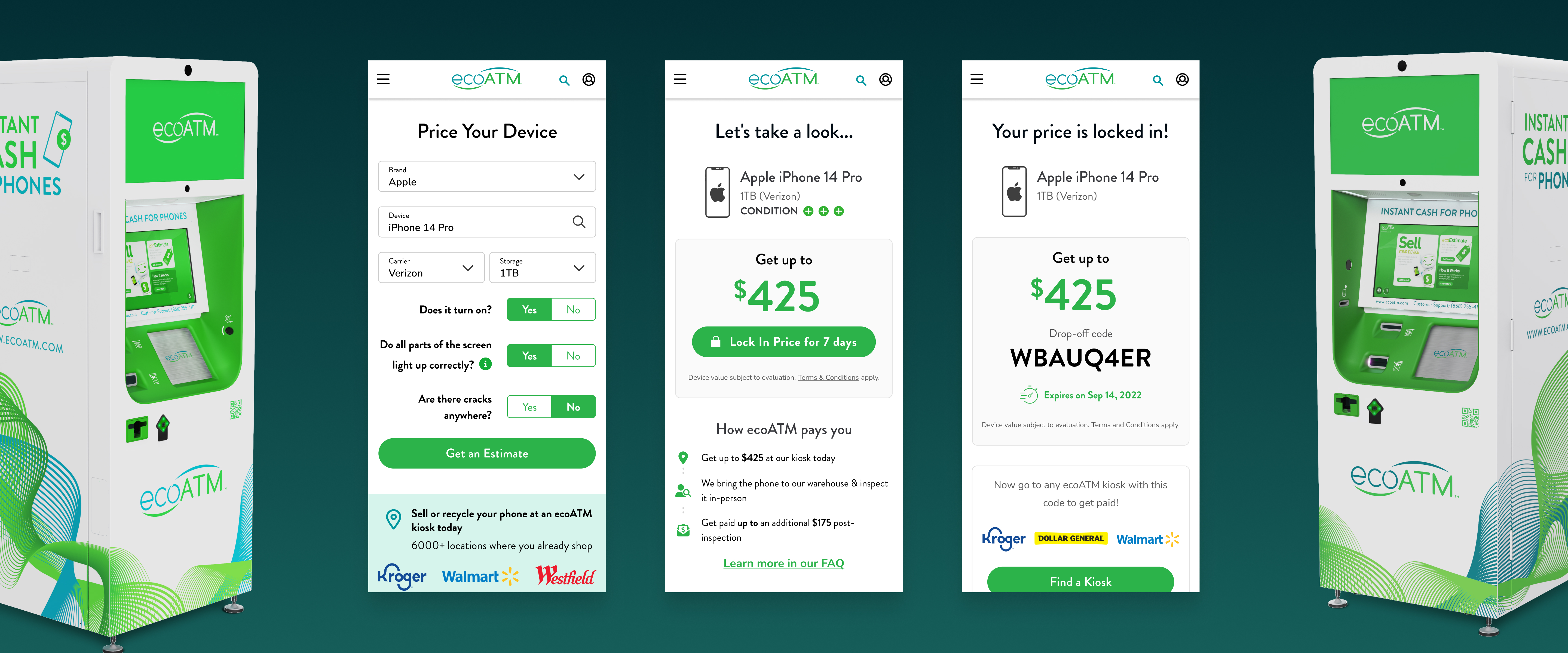
EcoATM has over 6000+ kiosks located in grocery stores all over the United States. Our kiosks pay people & buy old phones that would otherwise be lying unused in a drawer, or improperly tossed away in a landfill.

As a kiosk based business, we offer convenience to our customers. You can sell your old phone & get money for it in the same day. Other online phone buying sites require you to send in your device and wait for an inspection result to get paid, this process can take up to a month.
The trade-off for consumers is that while we are fast, we are less competitive on price compared to online phone buying competitors. They have the ability to have a human carefully check cosmetic & functional condition before paying, while we conduct our evaluations directly our kiosks.

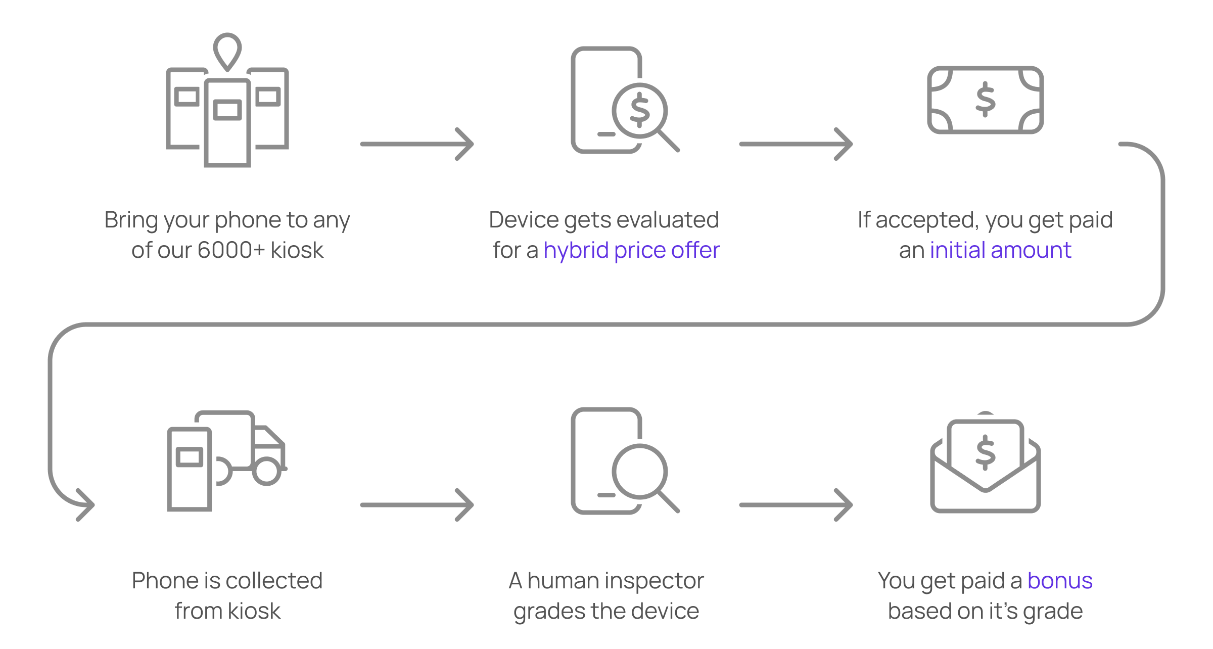
Hybrid Pricing was a new feature designed to bridge this pricing gap between us and our competitors. The idea was that we would offer an initial amount up-front at the kiosk, and then pay a bonus amount after we conduct an in-person inspection at our warehouse.
This was the proposed experience:
What made the hybrid pricing project complex?
The Hybrid Pricing feature had a fair bit of complexity. In addition to messaging to customers about Hybrid Pricing on the kiosk, we also had to message this on our website and mobile app where customers could get a price estimate. In addition, after they sold their device, we needed to keep in contact to tell them about their bonus status.

Messaging Hybrid Pricing on ecoatm.com
Because the Hybrid Pricing had so many channels, I worked closely with another designer for this project. She primarily worked on Hybrid Pricing for the kiosk, while I focused on our web, mobile app, and email experience.
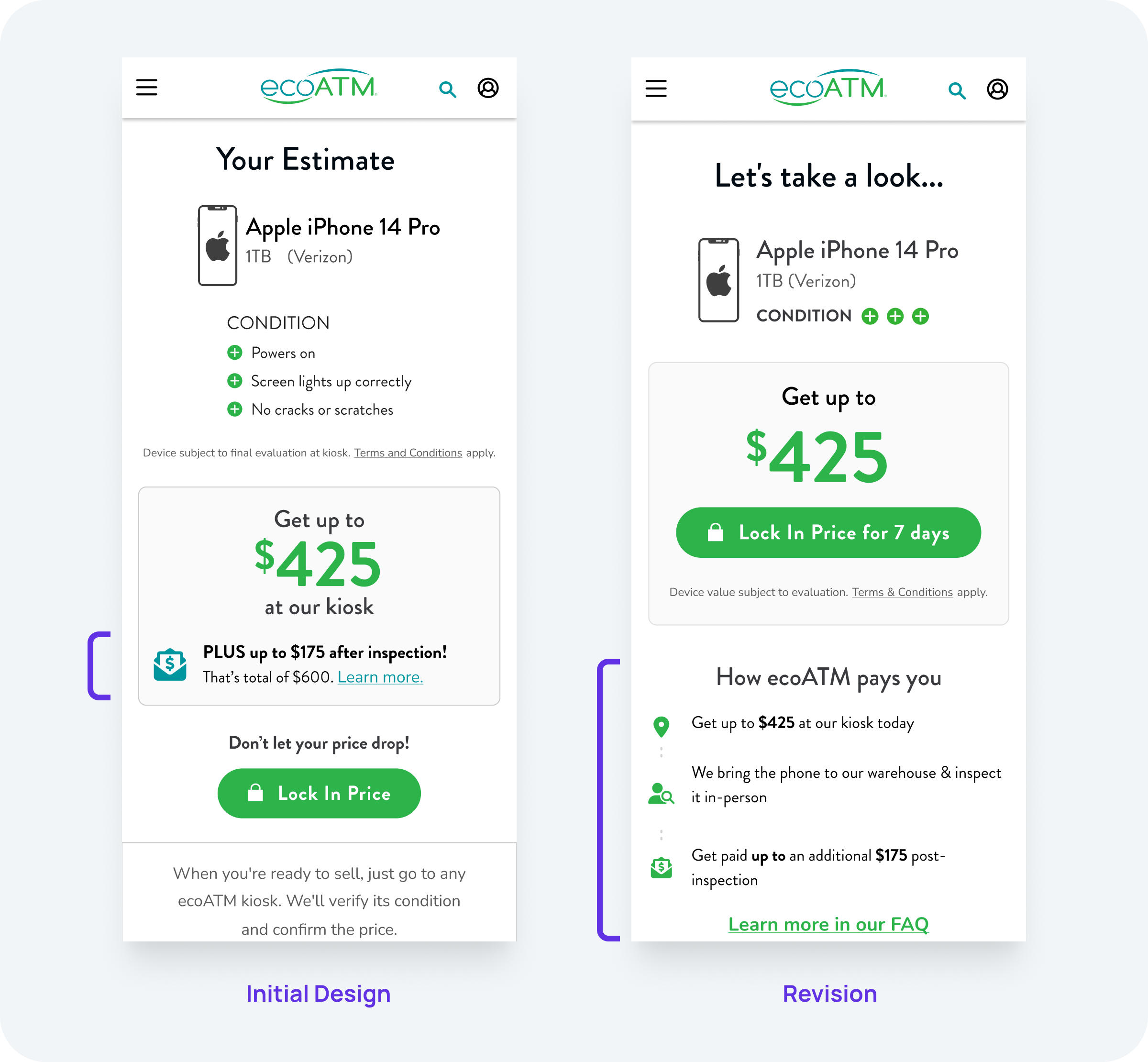
This was the initial user experience for people getting a hybrid estimate on our website:
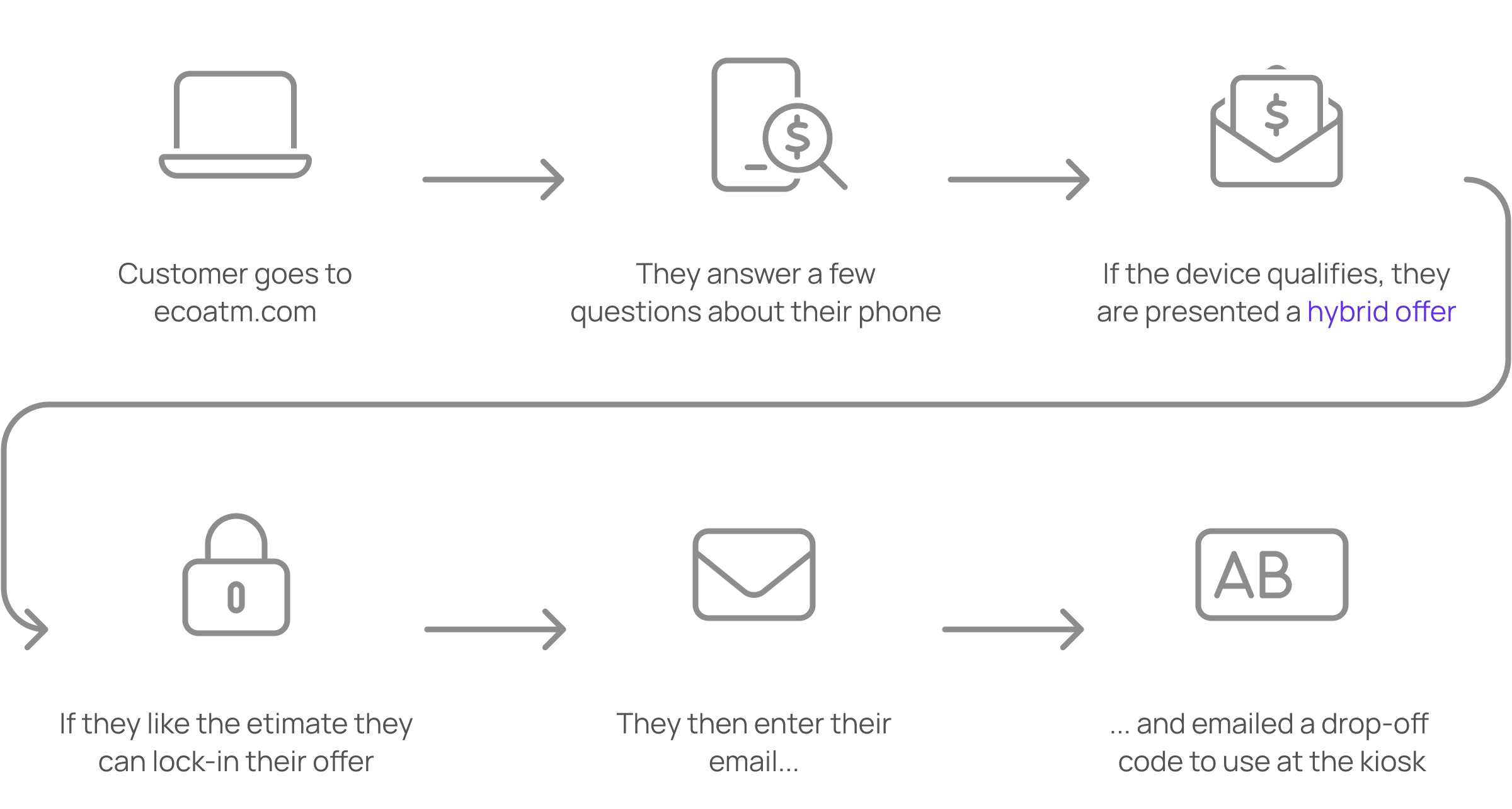
Initially on the estimate page we displayed the amount of money they would receive at the kiosk. We then had a short blurb underneath explaining the potential bonus. What we found after talking to our customers is that they found the bonus confusing because they were not used to being paid in multiple steps. We had to find a clearer way to message this multi-part payment.
After exploring a variety of different design options, we ended up going with a timeline view. Users already had some familiarity with this UX pattern – often seen on screens like on-boarding. This design took up more vertical space but it was worth it for the extra clarity.
Business goals vs customer experience
Like with many real world projects, there were conflicts between what the business wanted and the ideal user experience.
Example 1: Which price should we display?
After walking through our Hybrid-Pricing designs with leadership, there was a strong push for us to display the full Hybrid Price on the initial estimate screen.
The idea was that people would be more enticed by the full price, leading them to convert, and ultimately going to a kiosk and selling. As designers we were worried that leading with the full Hybrid Price could feel misleading to customers that did not carefully read.
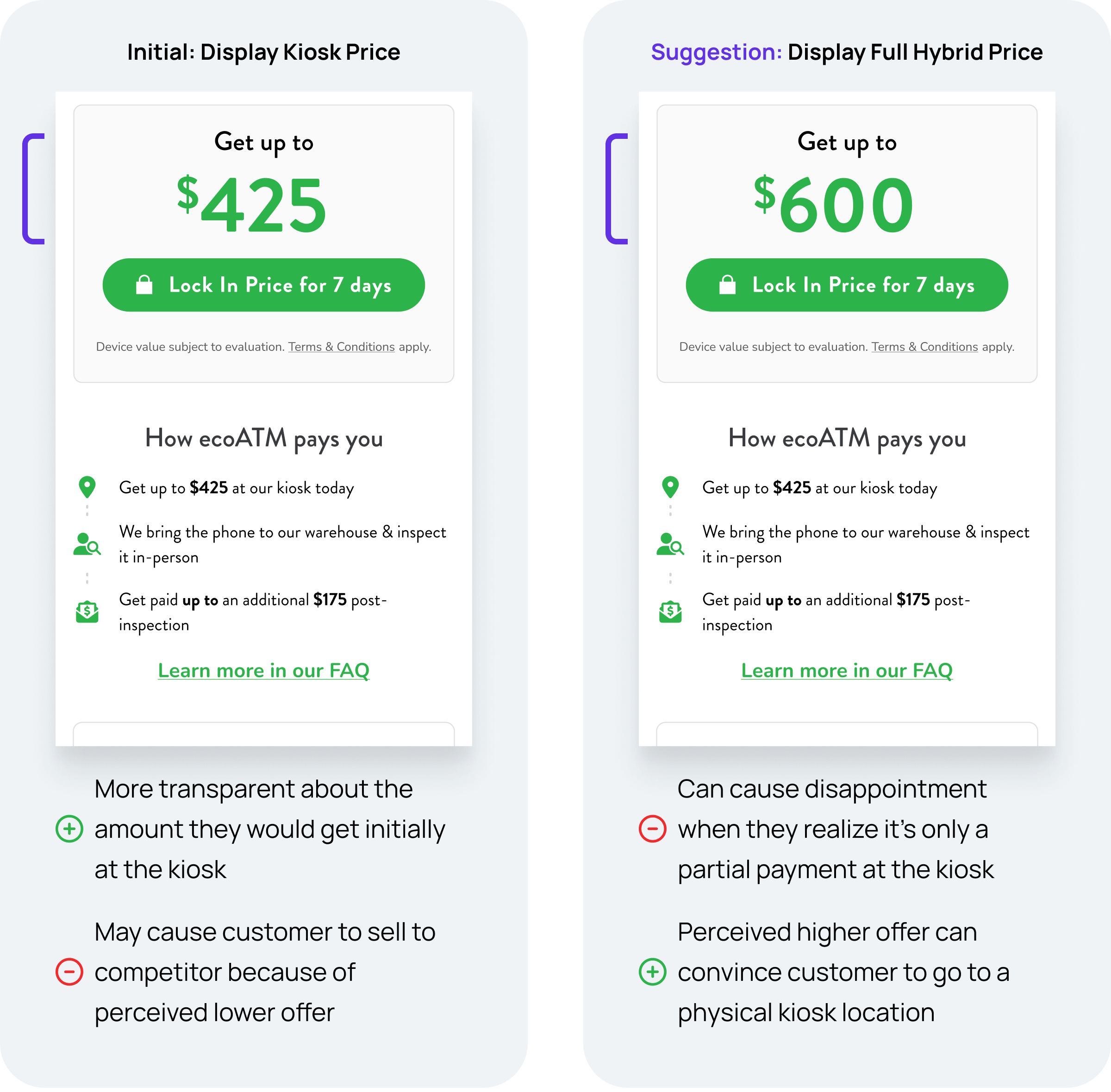
When we ran a user survey, we found that customers were in fact more willing to convert when faced with the Full Hybrid Offer over the the design showing amount they would be paid at the kiosk. Another thing that we discovered, was that while users found partial payment to be unusual, they understood from clicking through the prototype that they would only be paid partial amount at the kiosk. This led us to revise the design to display the full hybrid offer on the estimate screen.
Example 2: When should we inform the customer of partial payment?
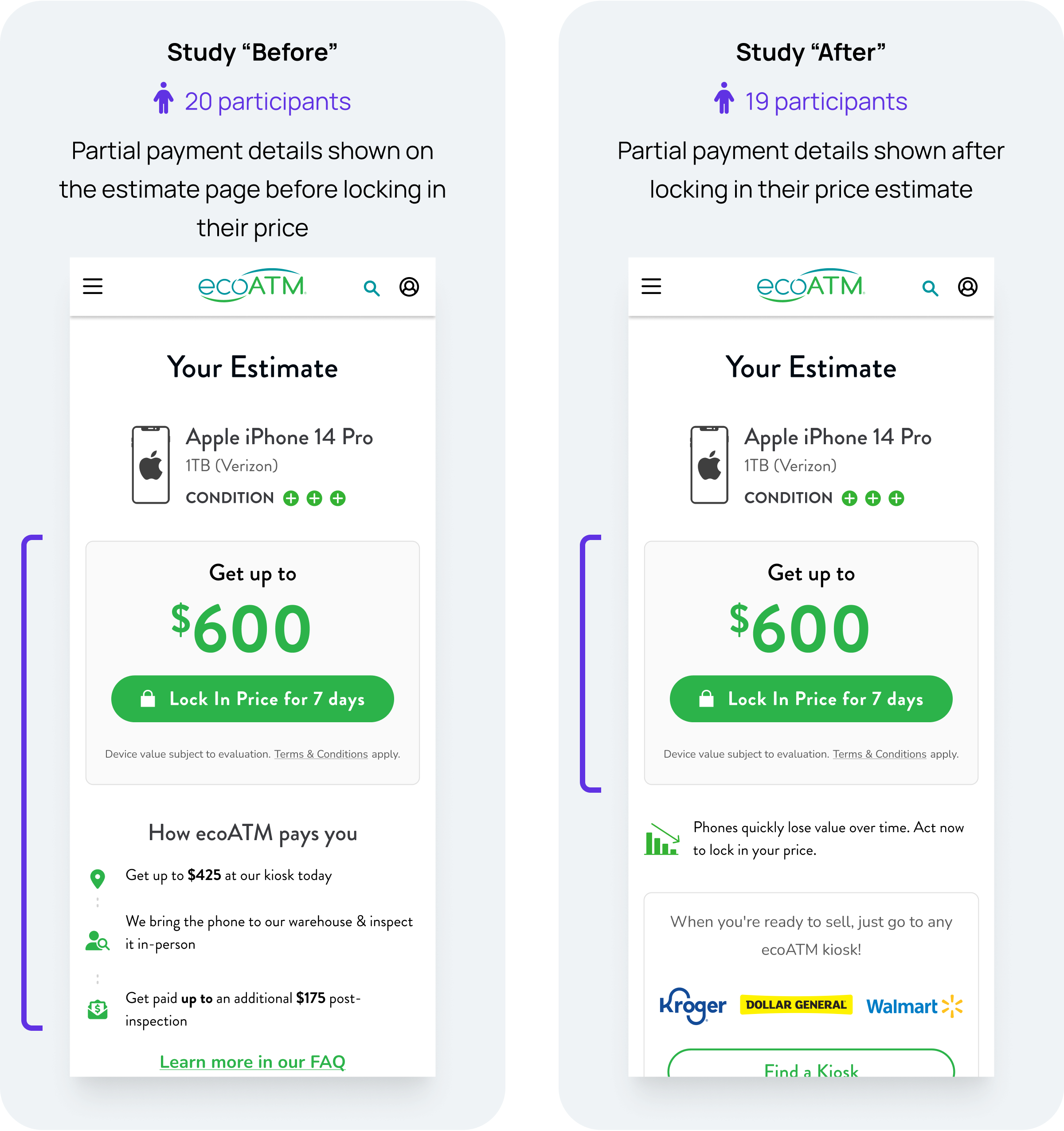
In another case, there was also a push from leadership to move “How ecoATM pays you” from the estimate page, to the lock-in page. This meant that customers would learn about the partial payment only after they locked-in their price. The hypothesis was that by telling them about partial payment after lock-in we would have better lock-in conversion.


Remote user study
To answer the question “At what point do we tell users about partial payment, before or after locking in their price?” we held 2 remotely moderated user studies. These were self moderated studies set up on User Zoom. We stopped the studies after we collected ~20 participants.
Here’s what we found:

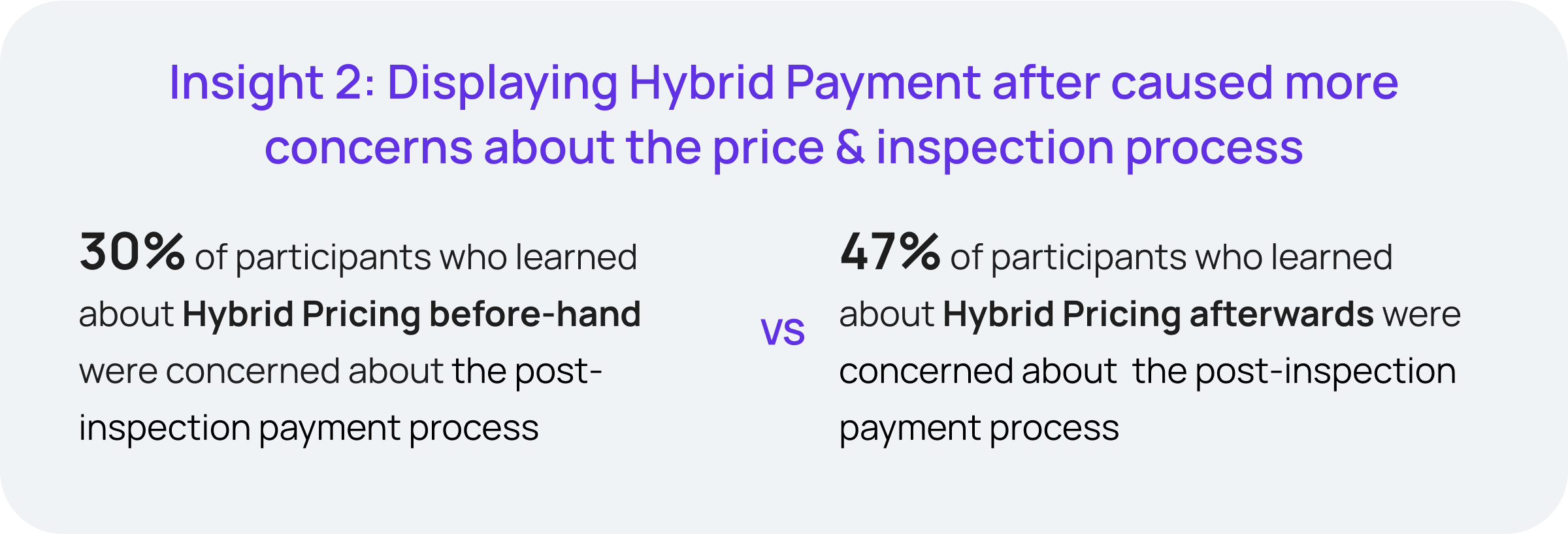
It became clear that it was a trade-off between lock-in conversion and customer trust. We were able to take this data to leadership and advocate for more transparency, ultimately leading to us going with our initial design.
How this story ends…
We initially released Hybrid Pricing to a small subset of kiosks at the end of 2023. We ended up having to put a pause on the experiment because of issues at our warehouse preventing us from properly processing these devices. Nevertheless we learned a lot from this initiative, and have applied our learnings to other initiatives in the following year.
