Jisho.org: a modern dictionary redesign
2020
UI Design
Web App
Jisho.org is an online Japanese dictionary, I’ve relied on it countless times while learning the language and wanted to see if I could improve on its minimalistic design. The following is a screenshot of it’s homepage.
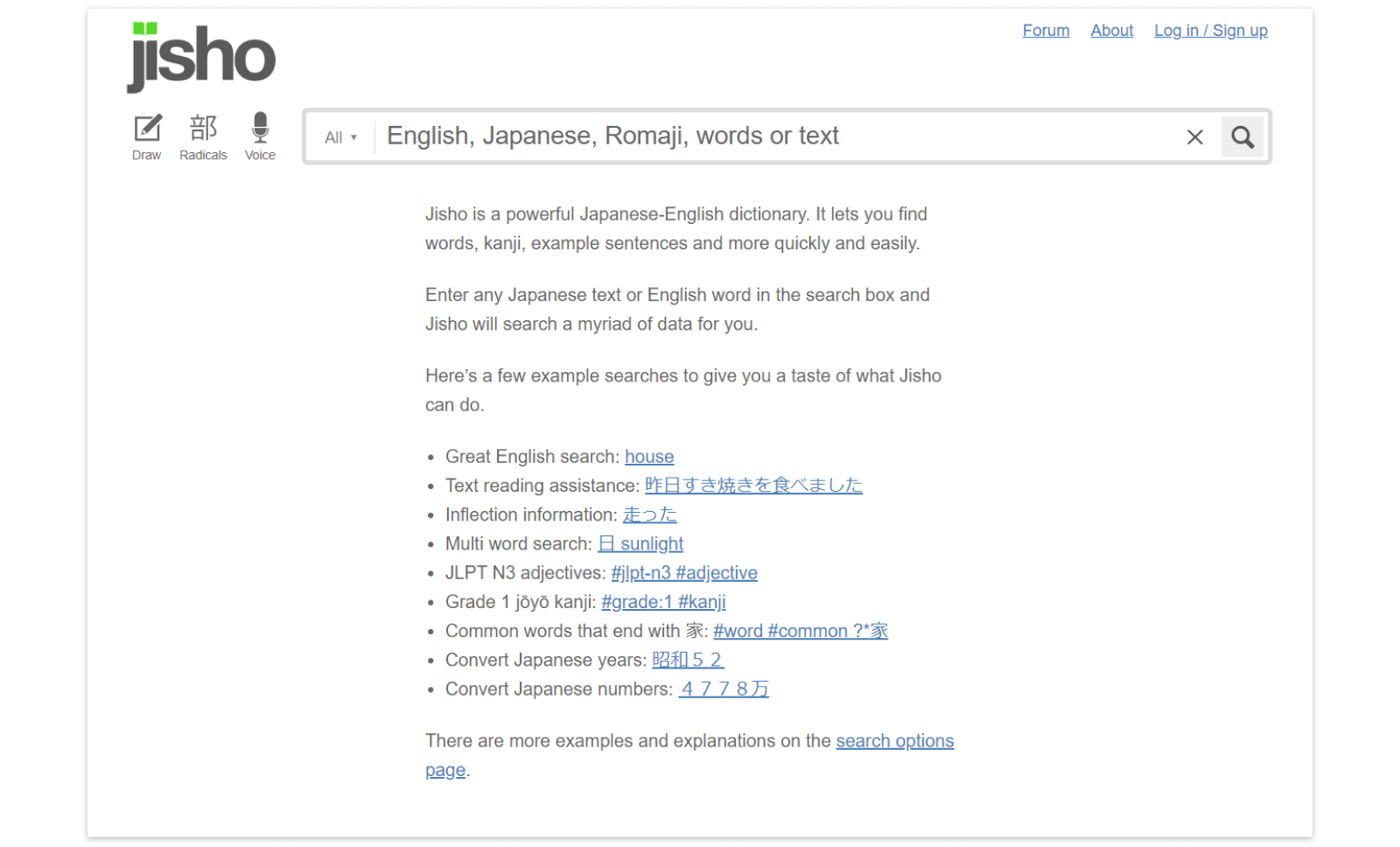
While I really like its simple aesthetic, I thought that there were a few opportunities to bump up its polish, to simplify some of the text, and organize the information so that it’s even easier to use.
Goal: For this case study I wanted to redesign the desktop version of Jisho.org focusing on modernizing its look and encouraging people to explore advanced search capabilities like sentences lookup and filtering.
Analysis
When redesigning anything I like to start off by doing a basic analysis of the current design.
Here are a few things that stuck out to me about Jisho’s homepage,
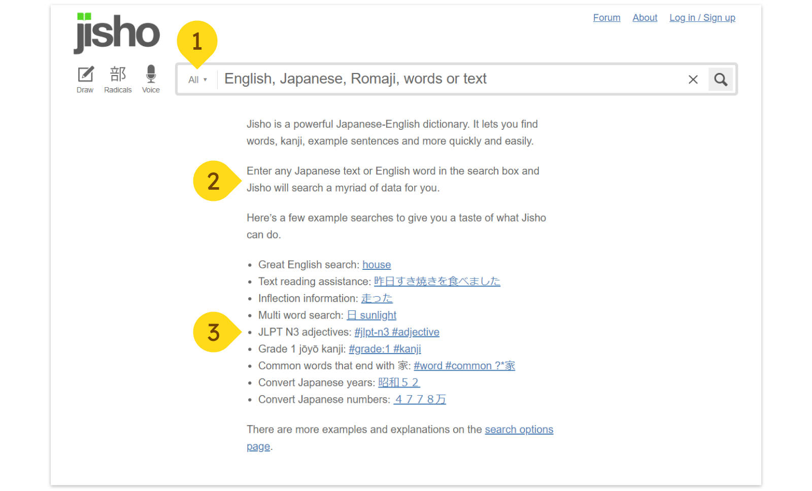
- Search features are hidden away under a dropdown. By making the available filters more visible you can teach a user how to start using some of the more advanced features like searching only “words” or searching for “sentences.”
- There is a lot of text. While the explanation of the site is important, this amount of text would cause many users to gloss over it. Even just some simple styling of the text would make it more visually interesting, drawing people’s eyes to it.
- Example overload. There are so many options for examples for ways to search here that a user can almost feel overwhelmed. By reducing the examples we can actually increase people’s attention to this section.
After analyzing the homepage, another important page to take a look at is the results page after I enter my search. The following screen is the result for “Hiyake”, which means sunburn.
Here are a few things that stick out to me about Jisho’s results page,
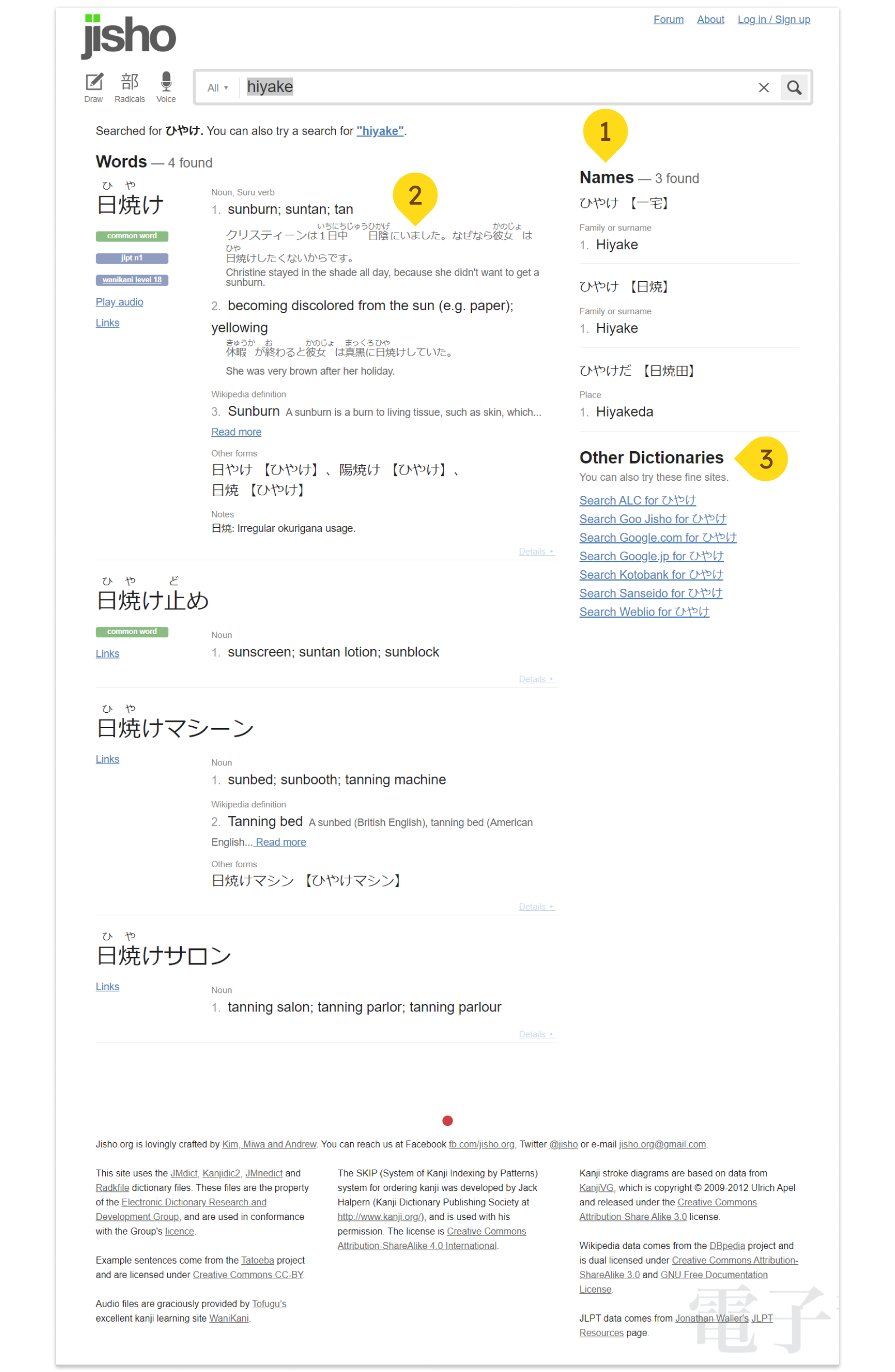
- There are 2 different types of search results, “Words” and “Names”. They’re currently organized in a column structure, which means both types of results are immediately visible to the user. As a heavy user of Jisho, I’m almost never searching for names. Hierarchy wise, words are probably much more important.
- It’s difficult to read the Japanese example sentences. As a non-Japanese native, we’re biased against reading the Japanese. The furigana (which tell you how to read the Chinese Kanji characters) while useful, break up the structure of the sentence making it further difficult to read.
- Other dictionaries are probably not frequently accessed. If a user was frustrated enough with the experience on Jisho, they would probably just google another Japanese-English dictionary, rather than choosing from one of these many links.
UI Design
After doing my analysis on jisho.org, there were a few things I wanted to do for the redesign.
- I wanted to keep the monochromatic color scheme because it keeps the site looking simple.
- I wanted to emphasize the filtering capabilities.
- I wanted to tweak the information hierarchy to make the site appear even cleaner than it already is.
In order to accomplish this, I made the following design changes to the homepage,
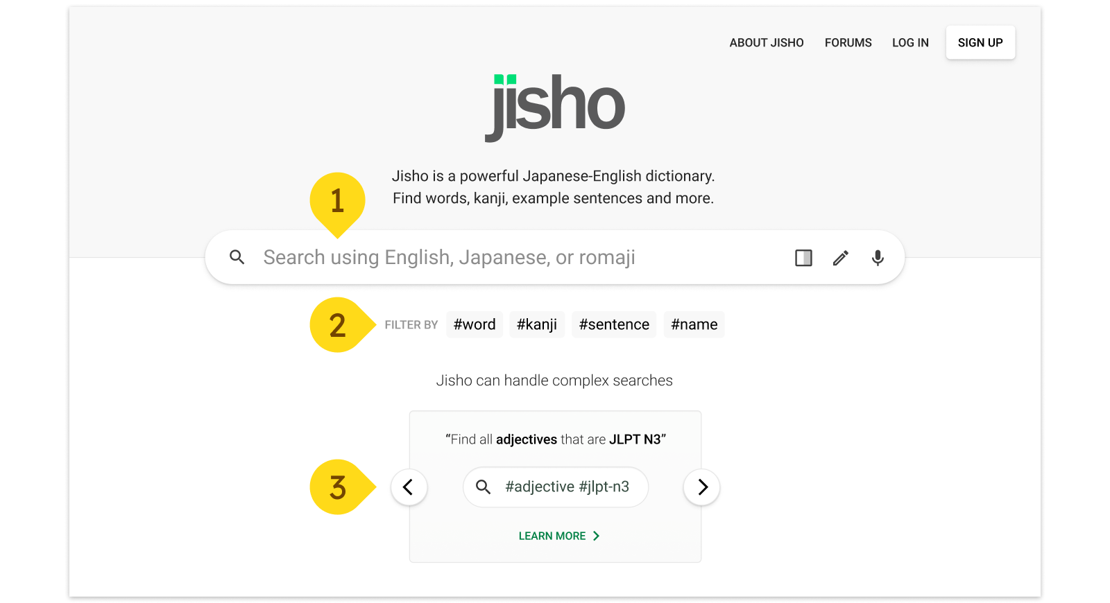
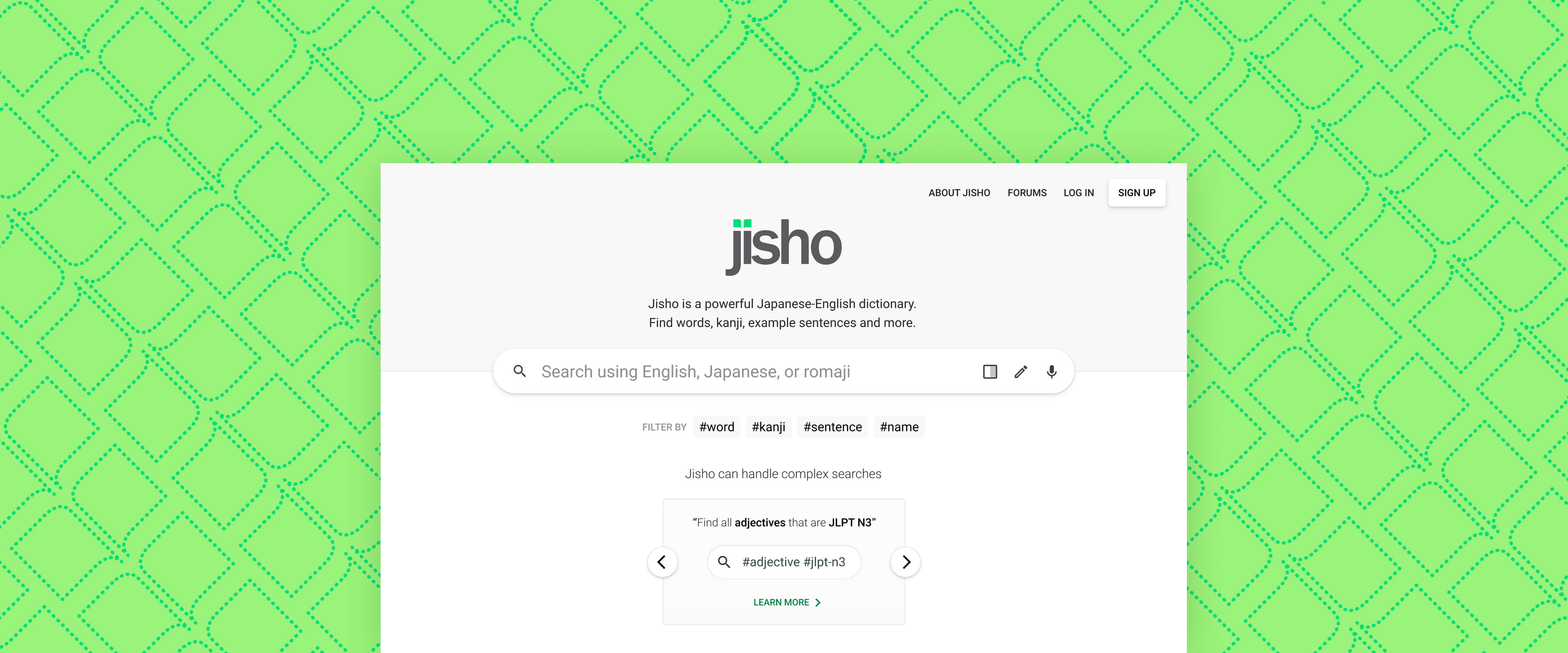
- Increased the prominence of the search bar since it’s the most important item on the page. This was accomplished by making it larger, bringing it closer to the center of the page, adding a drop shadow, and tinting the background grey so that it’d pop more.
- Brought the filters out of the dropdown menu. Before, the filters were hidden by the dropdown, but now that they’re out in the open, we not only increase the chances that people will use them, but also suggest to our users how to use other #filters.
- Organized the examples into a pageable card. This increases the prominence of the examples, reduces distractions, while still allowing people to browse through other examples if they want.
For the results page I did the following,
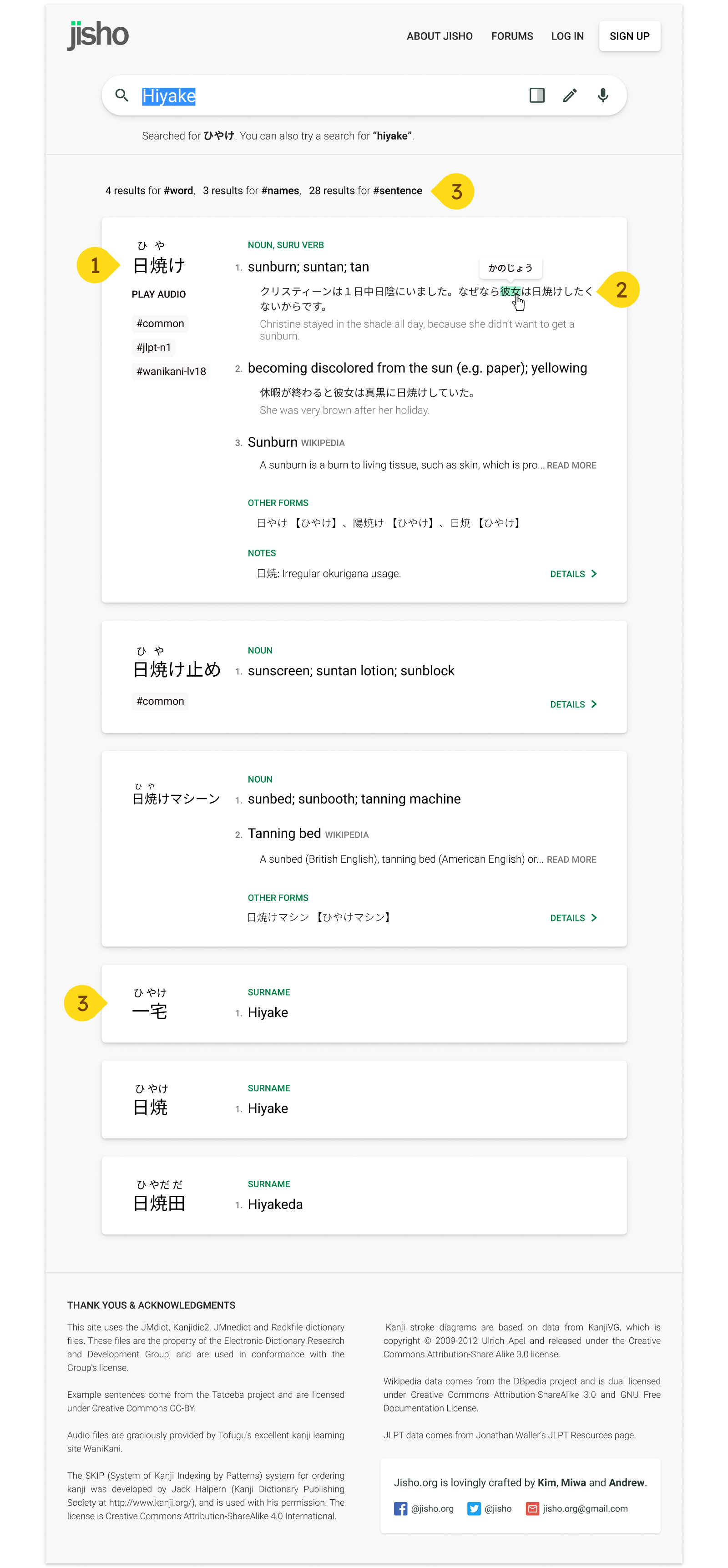
- Organized the search results into cards. This way there’s more distinction between each search result.
- Got rid of the 2 column structure. With a single column structure, “Names” now come after “Words” in the search hierarchy, making it less cluttered. By displaying how many results each filter has, the user can further refine their search if they want to.
- Made the example Japanese sentences easier to read, by removing the furigana and increasing the contrast of the Japanese sentence vs the English translation. When you hover over a Kanji it’ll display the reading, that way it’s only visible when necessary.
Credit
- Jisho.org is run by Kim, Miwa, and Andrew
- Icons from Material.io
- Social media icons from Icons8

