Lost & Found Media: recovering photos for street performers
2020
User Research
UI+UX Design
Website
Lost & Found Media is a concept idea for recovering pictures & videos taken of buskers, people who perform in public for tips. Our team of 5 developed this idea in a 6 week deepdive broken down into three phases, research, ideate, and prototyping.
Research
During the research phase we wanted to interview as many buskers as we could. Luckily for us Boston has a rich history of people performing in public places. We went into Boston reaching out to buskers in person as well as looking for people online who might be willing to be interviewed.
In two short weeks we talked to over ten different people in a long form interview and from these interviews we were able to create three different personas.
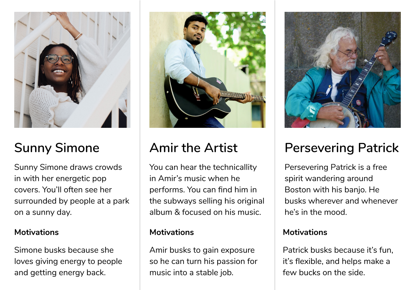
In addition to the personas we started exploring some of the needs that were expressed by our users during the interviews. We organized what people were saying into six opportunity areas for improving the lives of buskers.
- Space conflicts. While at first it may seem that buskers can play wherever they want, there are certain locations and times that are more premium for their foot traffic and tip amounts. One busker told us that “I feel awkward negotiating with other buskers about when/where I can play.”
- Collaboration/networking. The people we talked to seemed to be interested in collaborating/networking with other buskers, but because of the competitive nature of the busking system, collaboration efforts can lead to awkwardness.
- Recognition. Like our persona Amir, many of the people we talked to want something more than just performing on the streets, but a common sentiment we heard was “I don’t know how to get my music out to people”, and “I don’t know who my music has touched.”
- Audience Indifference. While many of our interviewees stated that audience interaction was one of the highlights of busking, oftentimes “It’s difficult catching people’s attention while playing, and people are usually too busy to stop and care.”
- Respect. While some people see busking as a form of art, others associate street performance with panhandling. “Bypassers don’t recognize me as a fellow human, oftentimes they tend to associate us with the homeless.”
- Weather. Busking is really unpredictable if you’re relying on it as a source of income. Things are often out of the busker’s control. “My relationship with the audience is largely dependent on weather. Bad weather puts people into bad moods.”
Using these six opportunity areas we then went and brainstormed a bunch of ideas on index cards and then sorted them on a large piece of paper from pragmatic to fanciful.

We then took the most compelling ideas and fleshed them out into idea cards so that we could introduce them to our users. One idea that resonated with our users was born out of the issue of how audiences take videos of buskers all the time while performing, but those videos almost never make it back to them.
Our idea was a service that would help buskers find all the photos and videos that audiences have taken of them, and then use that to help them market themselves on social media.
The following was the initial idea card for Lost & Found media we showed our users.
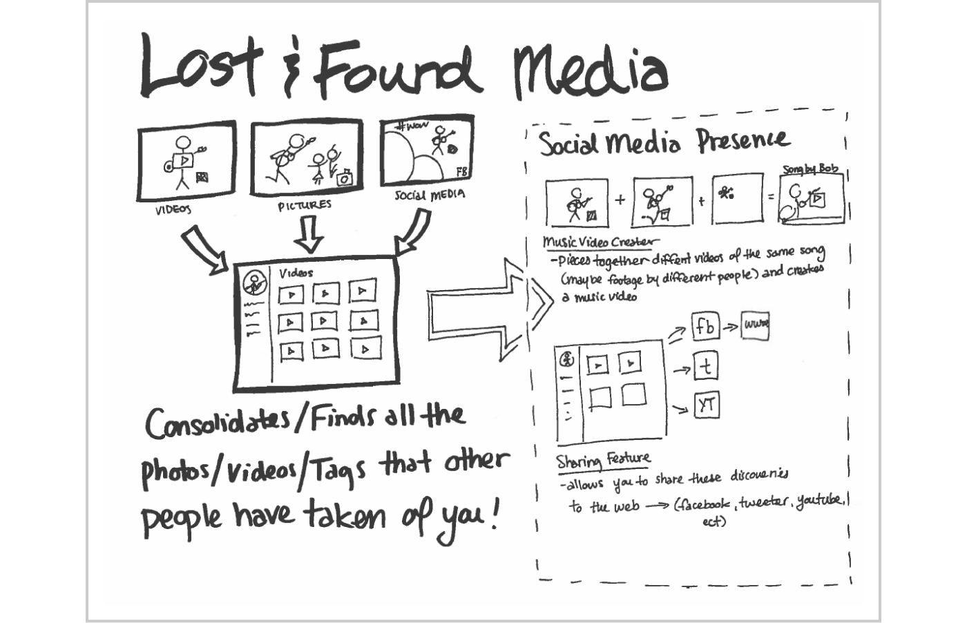
Lost & Found Media addressed our buskers needs of wanting
- To see those videos that audiences have taken of them.
- To connect with their audiences more (this time in the online realm).
- Ways to promote themselves and grow their career.
UX Design
From here on out, I did a solo exploration of what the service might look like. I scoped this exploration to focus on 2 specific parts:
- Creating a Homepage for Lost & Found Media selling and explaining the value of the service to potential customers
- Designing the initial user experience after the person has signed up, logged in, and is ready to find their pictures
Lost & Found Homepage
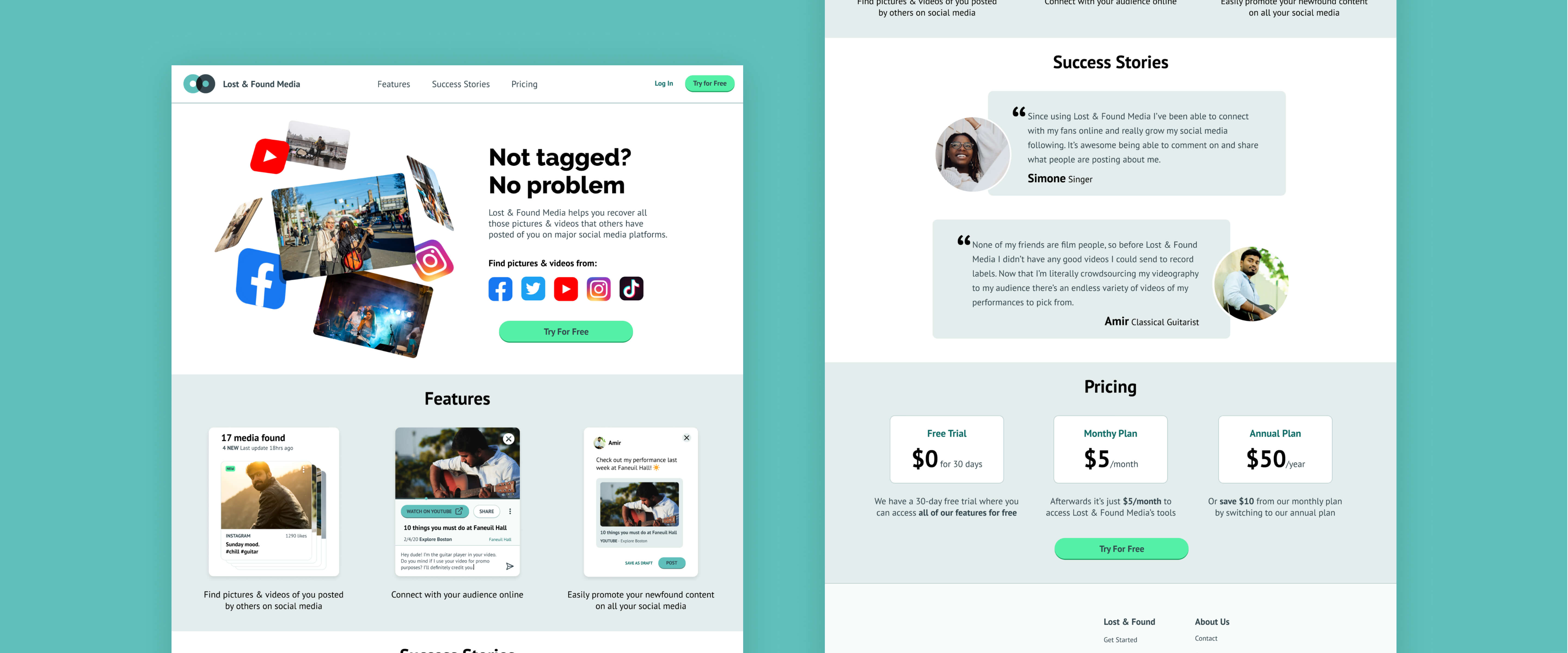
To reiterate, Lost & Found Media is a service that crawls various social medias for you and finds your lost photos & videos that other people have uploaded. From there you can choose to interact with fans online, share your newfound media with your online audience, or collect it for portfolio purposes.
In the age of SaaS (Software as a Service), it’s important to lay out to potential users what the value of the service is for them.
In Lost & Found Media’s case our target user (buskers) have talked about:
- How everyday they have photos of them taken by strangers that never make it back to them.
- Wanting that connection with their audience/fans.
- Wanting to promote their music and grow their career.
First, an overview.
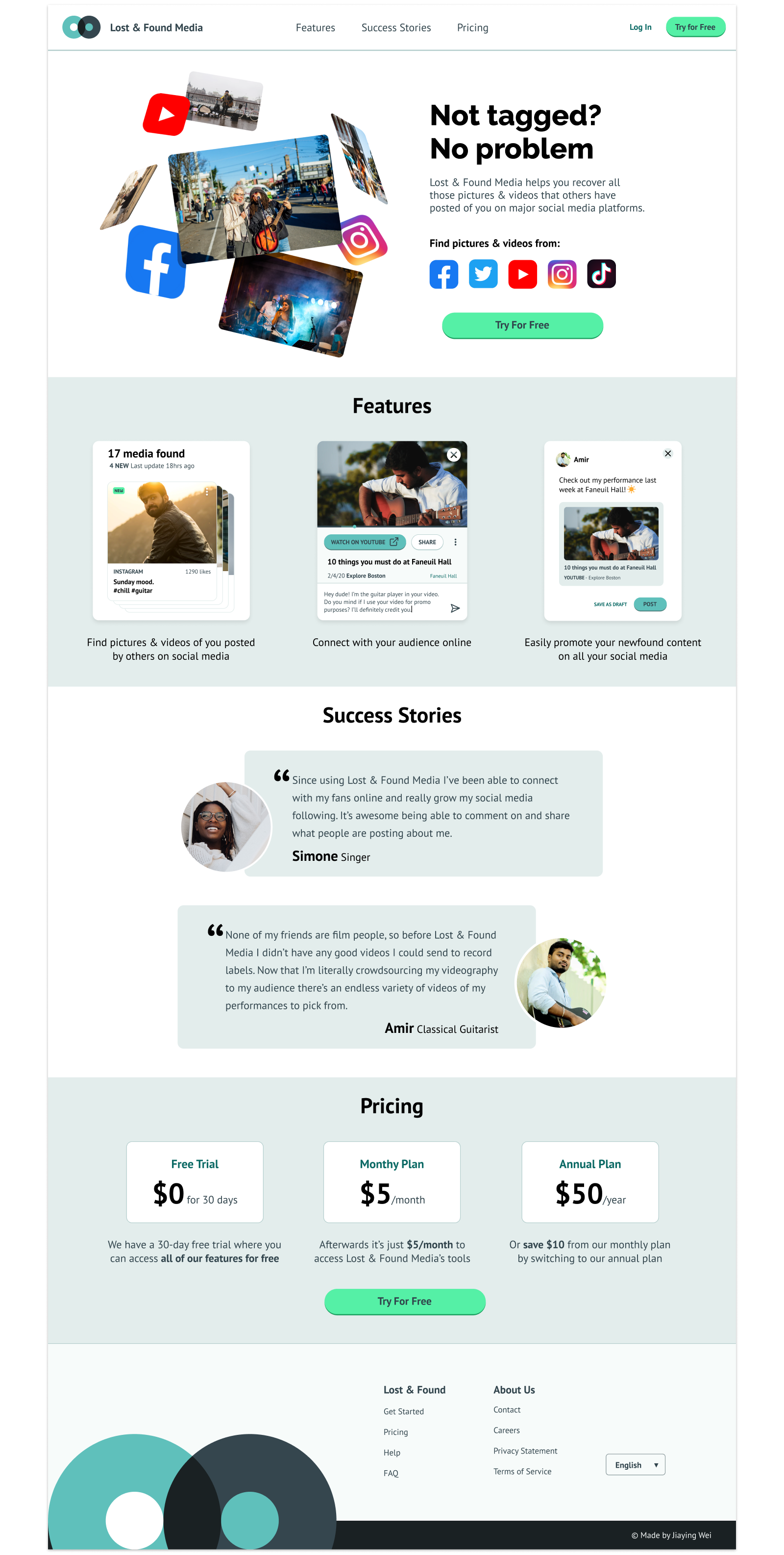
For Lost & Found Media’s homepage I’ve decided it to segment into 4 sections:
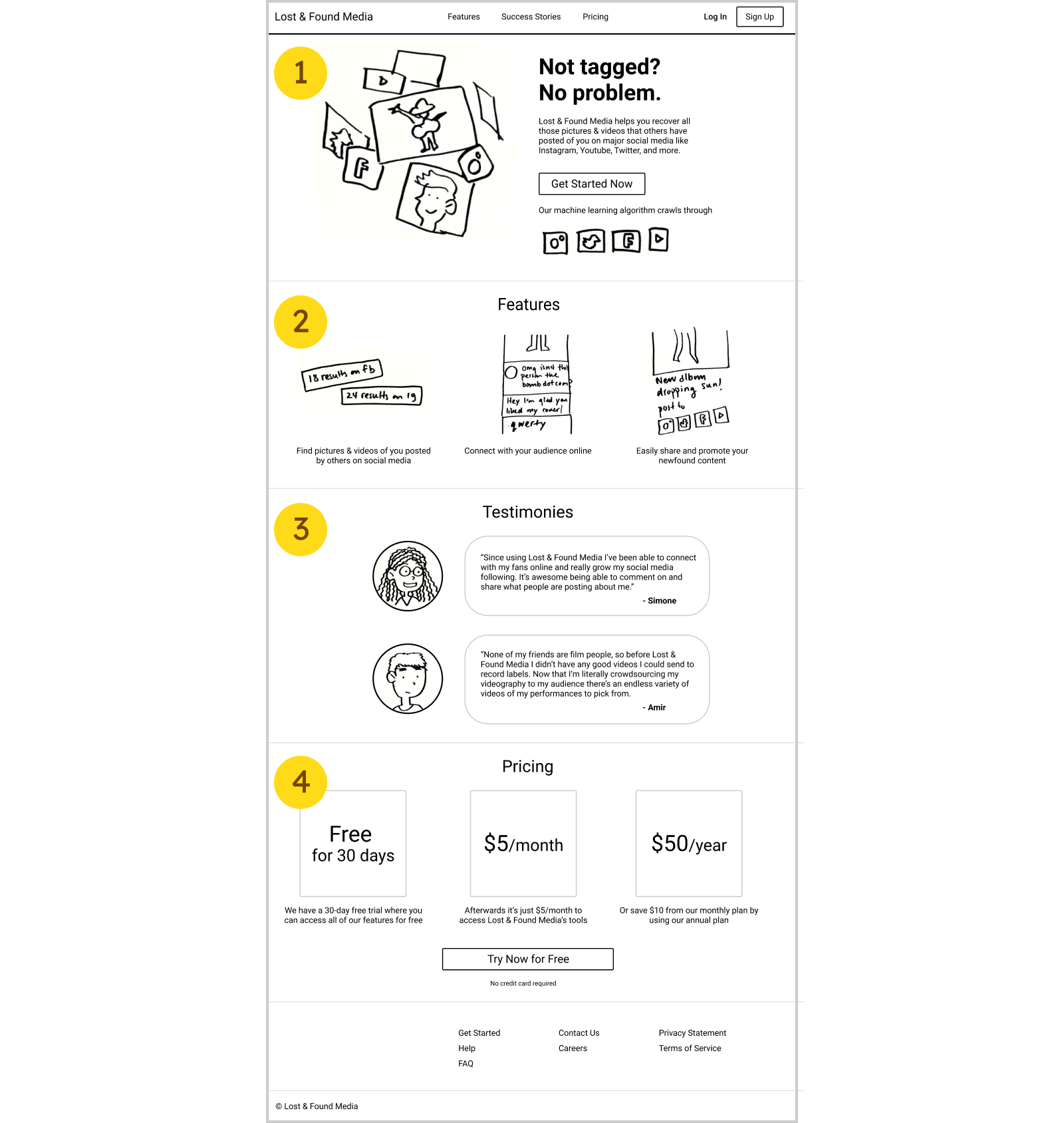
- The Hook. What is the main allure of this app (helps you recover your untagged photos).
- The Details. What are the other features that help you achieve what you want.
- Success Stories. How are some other people finding success by using this service.
- Pricing. An essential part of monetization.
Now that we’re done with the overview, I want to break down some of my thought processes for each section.
The Hook
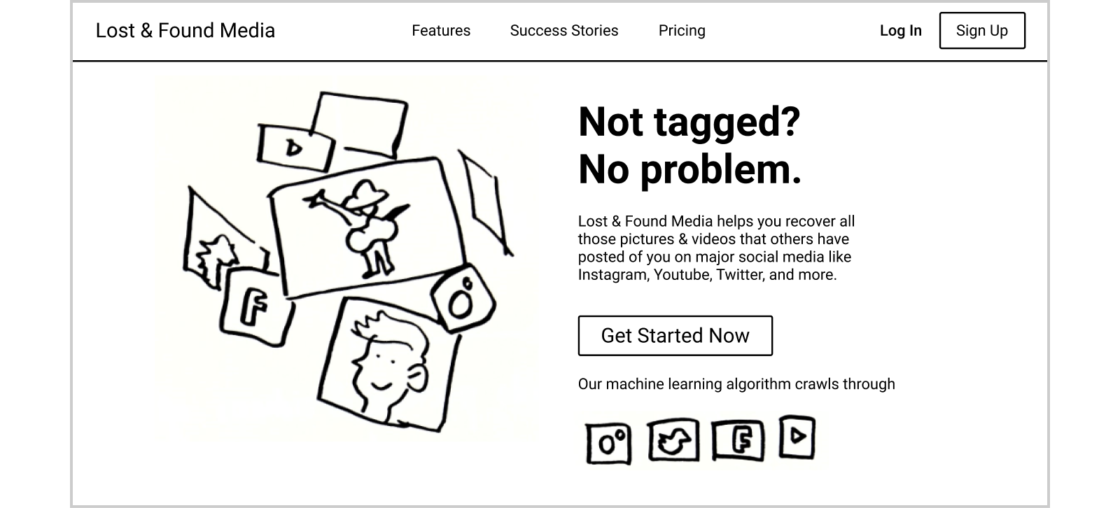
For the hook, I came up with “Not Tagged? No Problem.” which I thought that was an attention grabbing tagline that described the key issue that many buskers were facing. I include various social media icons in the description as a helpful visual for explaining where images comes from and to build familiarity by including brands users already trust.
The Details
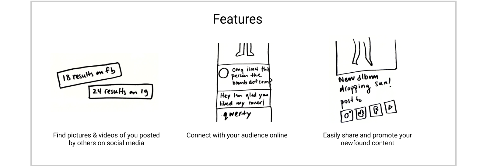
In the details section I matched various user needs/aspirations with features in the app so they can start picturing how they might use this service.
Success Stories
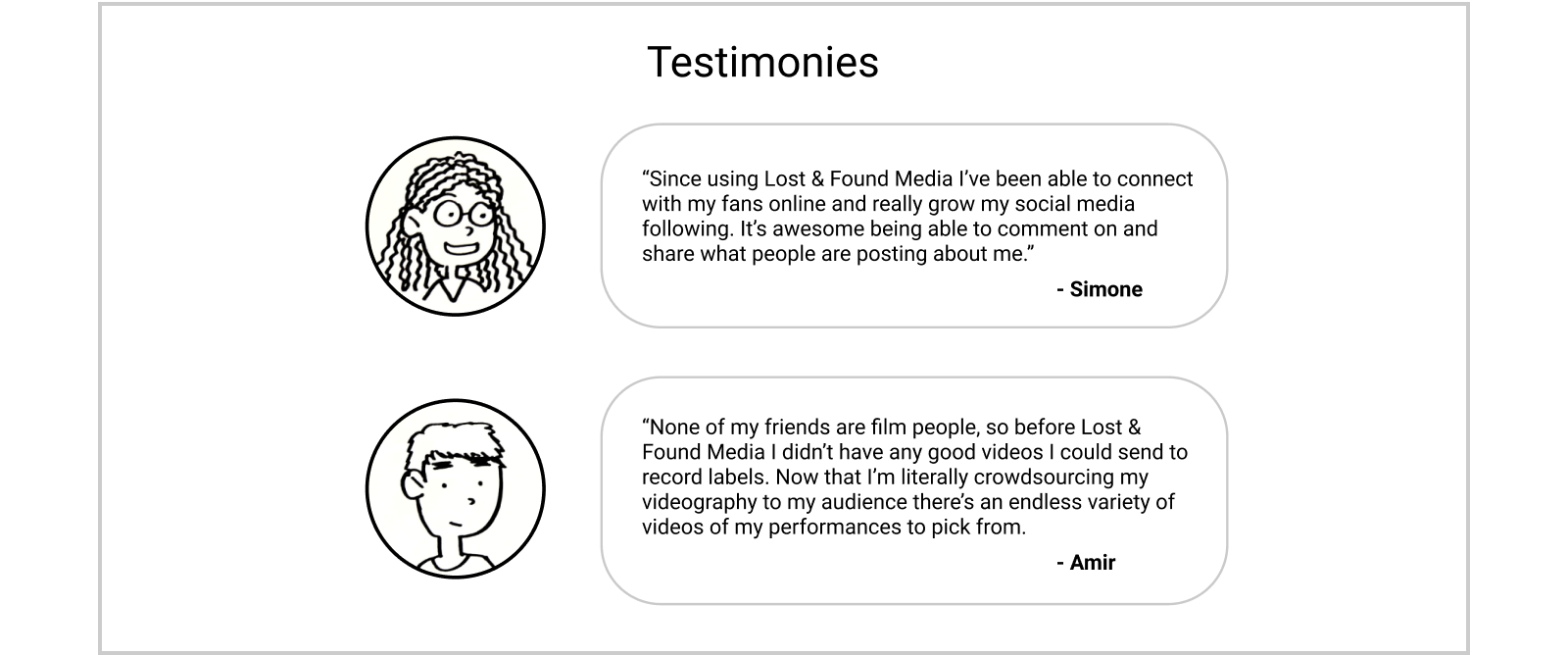
Testimonies are important because people always want to know what others think especially when it comes to things that are intangible like software or online shopping. It’s important to showcase how your service can help users achieve success.
Pricing
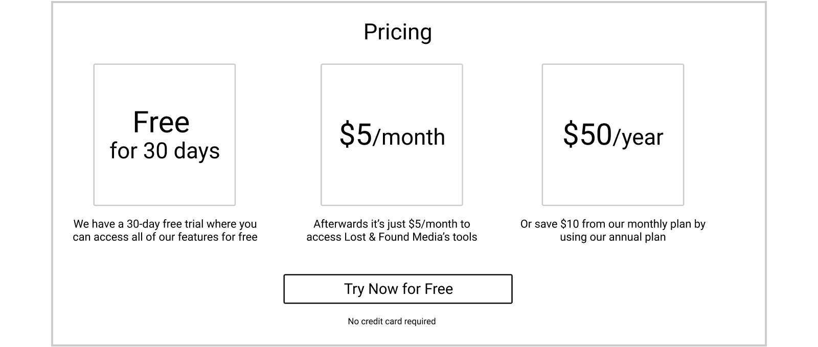
For the pricing I wanted to really emphasize the fact that they could try the service for free. One of the biggest barriers to starting a new service is always the price, which is why so many services offer a free trial. It’s important to lower that initial barrier to get people through the door and using your service.
Lost & Found Media Web App
After the user has finished creating their account is logged in, the first thing that we want to deliver on is our promise to find their lost pictures & videos. While I don’t know how the system backend will work, sifting through a ton of social media pictures looking for matches is probably not a quick process. That’s why it’s important to manage expectations.
To do this I used the following tactics,
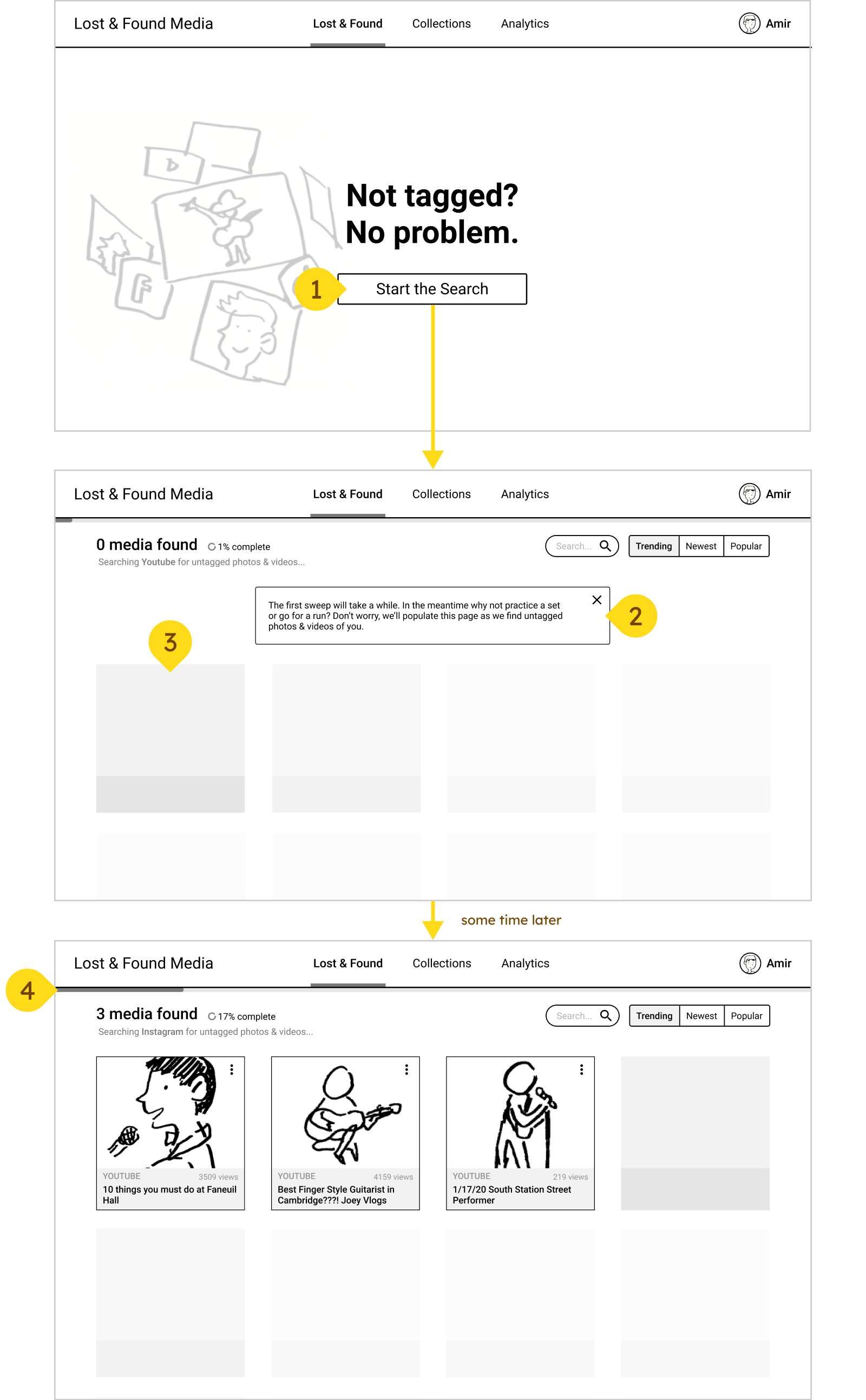
- Give them that satisfaction of pressing the start button, while we can skip this initial state by having users land on the “looking for media” page. Who doesn’t like turning something on for the first time and watching it whirl.
- Tell them that it’s going to take awhile and maybe they want to go and do something else so that they’re not just waiting.
- Mask the “found” pictures so that users not faced with a blank screen with nothing and can feel a peace of mind knowing that pictures will eventually start flowing in.
- Give them a progress bar, so they know approximately how much time is left.
After results start flowing in, clicking on a image will allow the user to,
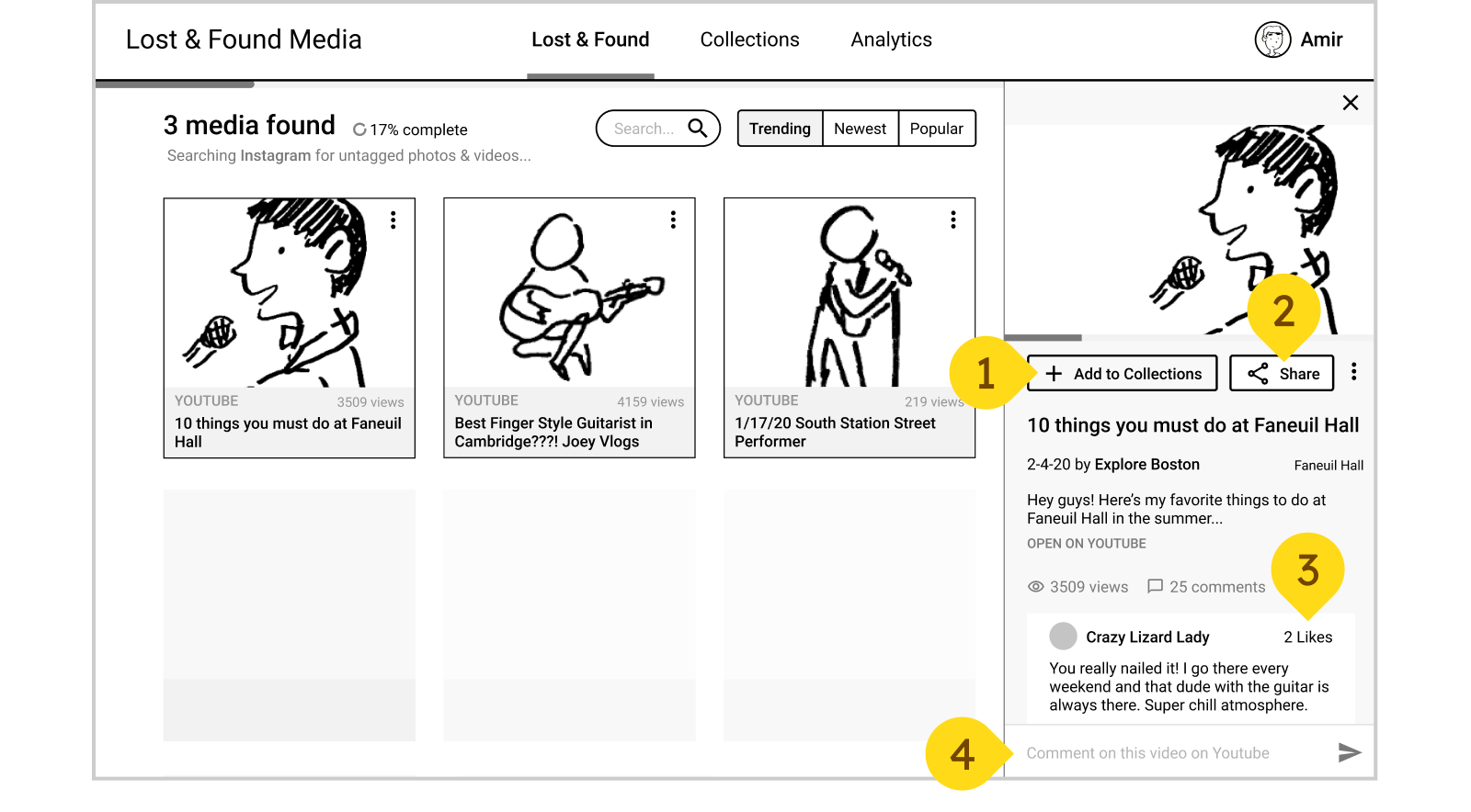
- Add it to their collections where they can sort & tag their favorite photos & videos.
- Share it with their existing social media audience.
- Read some of the comments and see what people are saying.
- Comment on the post, allowing them to broaden their social media outreach.
If they choose to share that post, it pops up another window where they can,
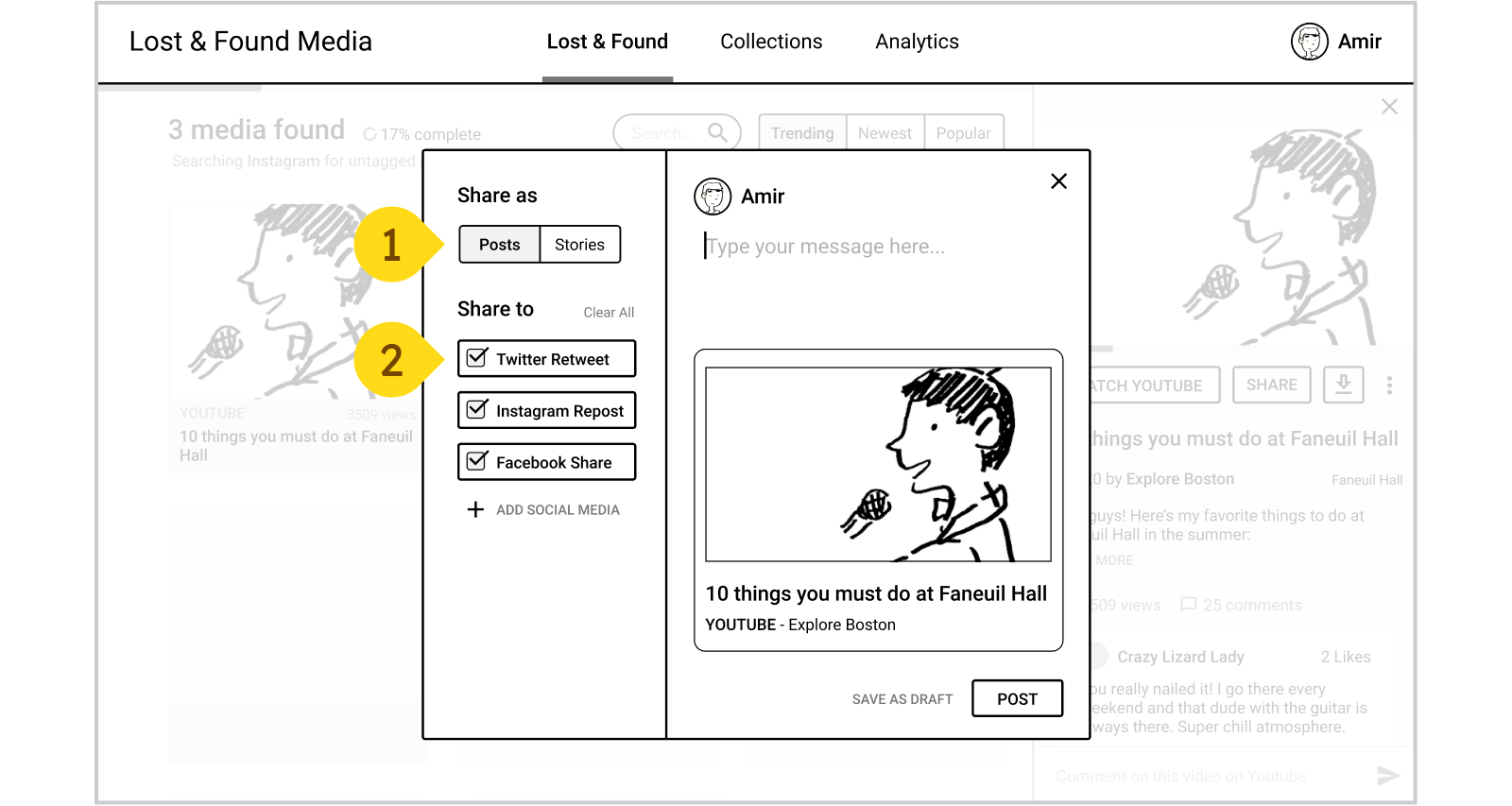
- Choose what format to share in, as a normal post or a story format.
- Choose from multiple social media to share all at once.
My next steps in further building out this app would be to start designing the “collections” page where the user can organize images & videos they’ve saved.
UI Design
So the first screen that I did the UI design for was on the application side of Lost & Found Media. I knew that I wanted to start there because it was one of the more complex screens and would dictate more of the UI rules that get created.
When working on UI design it’s important to consider the character of the app. Because Lost & Found Media’s target audience are buskers I wanted it to be on the funner side, but at the same time since it is a professional tool I didn’t want to wander too far into the realm of silly.
To achieve a friendly look I decided to,
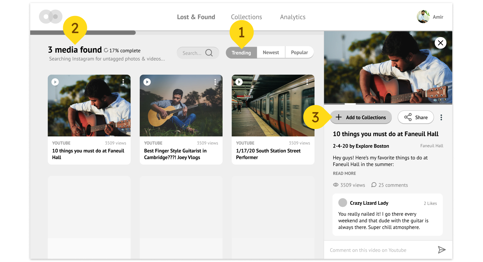
- Round the corners on some of UI elements like buttons & tabs
- Choose a rounded san-serif font for the text
- Use a solid shadow for UI elements for a lego block look
- Initially, I kept it monochrome so there were less decisions I needed to make from the offset.
After designing the major UI components of the app, I wanted to decide on the color pallet. Again, the tone that I’m going for is fun but also professional, so my candidates for my base colors were all from the bright but slightly dusty range. Some colors I tried were turquoise, a dusty pink, and a pinky beige.
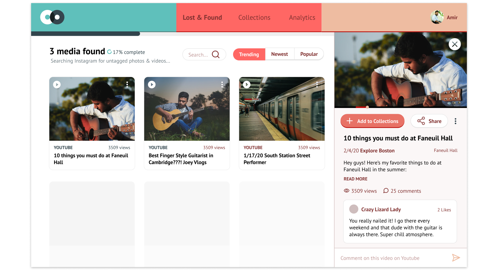
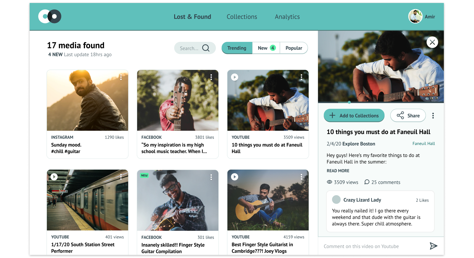
While the pink and the beige were more whimsical, I ultimately went with turquoise for it’s more professional looking tone.
Homepage
So the homepage wasn’t going to be too difficult to design. I already had my wireframe laid out, all I had to do was expand some of the design language I set when I designed the previous screens. One addition that I did add was an accent color (neon green) that would pop off the page and help draw people’s eyes to important items like the “Try For Free” button.
Logo Design
The logo for Lost & Found Media is simple, but I thought it had some cool symbolism so I’m going to take some time to introduce it.
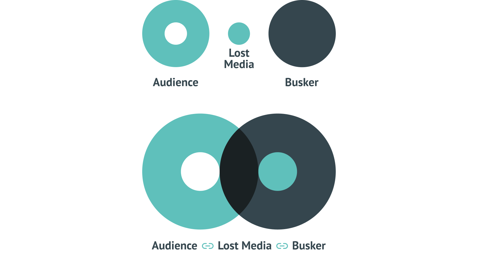
- The larger circles symbolize the audience and the busker. The smaller circle symbolizes all those photos & videos.
- When put together the logo symbolizes not only that the lost media is returned to the busker but also the newfound connection between the two sides.
- Also it looks like two records overlapping so that’s cool.
Credit
- User Research done with Celine Ta, Cecelia Auerswald, Sidd Singal, & Andrew Yeam
- Stock Photos from Unsplashed
- Icons from Feather
